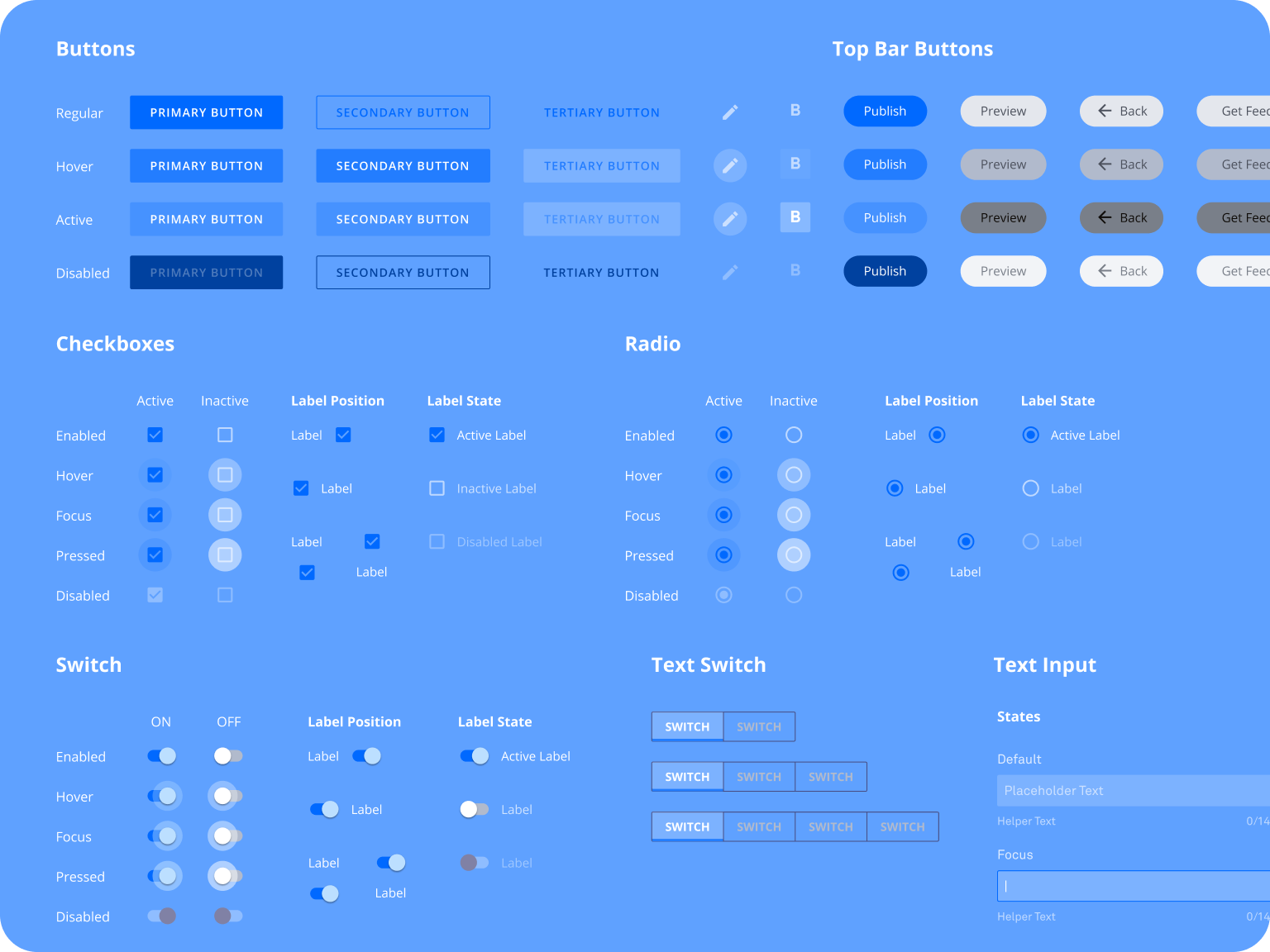
Kits & Components
Unifying UI for Leadpages 🛠️

PROBLEM:
Leadpages consisted of two key parts: the main app and the landing page builder, each with a completely unique set of UI components and styles. This inconsistency caused a disjointed user experience, as moving between the two areas of the product felt visually disconnected. Our design team aimed to unify these components and styles for a more cohesive and seamless user experience. However, the engineering team lacked the capacity to fully overhaul the styles, which made it difficult to completely align the two systems. We needed to introduce gradual changes without making any part of the app appear "broken" or confusing to users, while also avoiding mix-ups between the two distinct styles during the redesign process.
SOLUTION:
To tackle this challenge, my team focused on incremental changes that would gradually bring the two styles together. We prioritized adjustments that had the highest visual impact without requiring significant engineering effort. Throughout the process, we maintained careful attention to ensure the design remained functional and intuitive, avoiding any potential confusion for users. We also implemented strict design guidelines to prevent mixing up the two sets of styles when working on different areas of the app. By staying diligent in our communication and keeping all styles accurate and up-to-date, we successfully aligned the main app and landing page builder components, improving the user experience without overwhelming our engineering resources.


